Honeysuckle Schoolhouse
Modern rebrand elevates Austin school with simplified design that gets noticed.
Creative Consultant; Logo & Brand Design
The Client
Honeysuckle Schoolhouse is a small home preschool in Austin offering a nurturing environment where children can connect with nature. Positioning themselves as "a home away from home," they provide a safe, fun space for children to explore the natural world, emphasizing outdoor play and discovery as fundamental to early childhood development.
The Challenge
The preschool's existing identity featured an intricate, dated logo that struggled with legibility at smaller sizes—particularly problematic for social media applications and digital presence. The brand elements lacked cohesion and failed to effectively communicate their nature-focused educational philosophy. Honeysuckle needed a comprehensive rebrand that would resonate with families while maintaining recognition in the competitive Austin preschool market.
The Solution
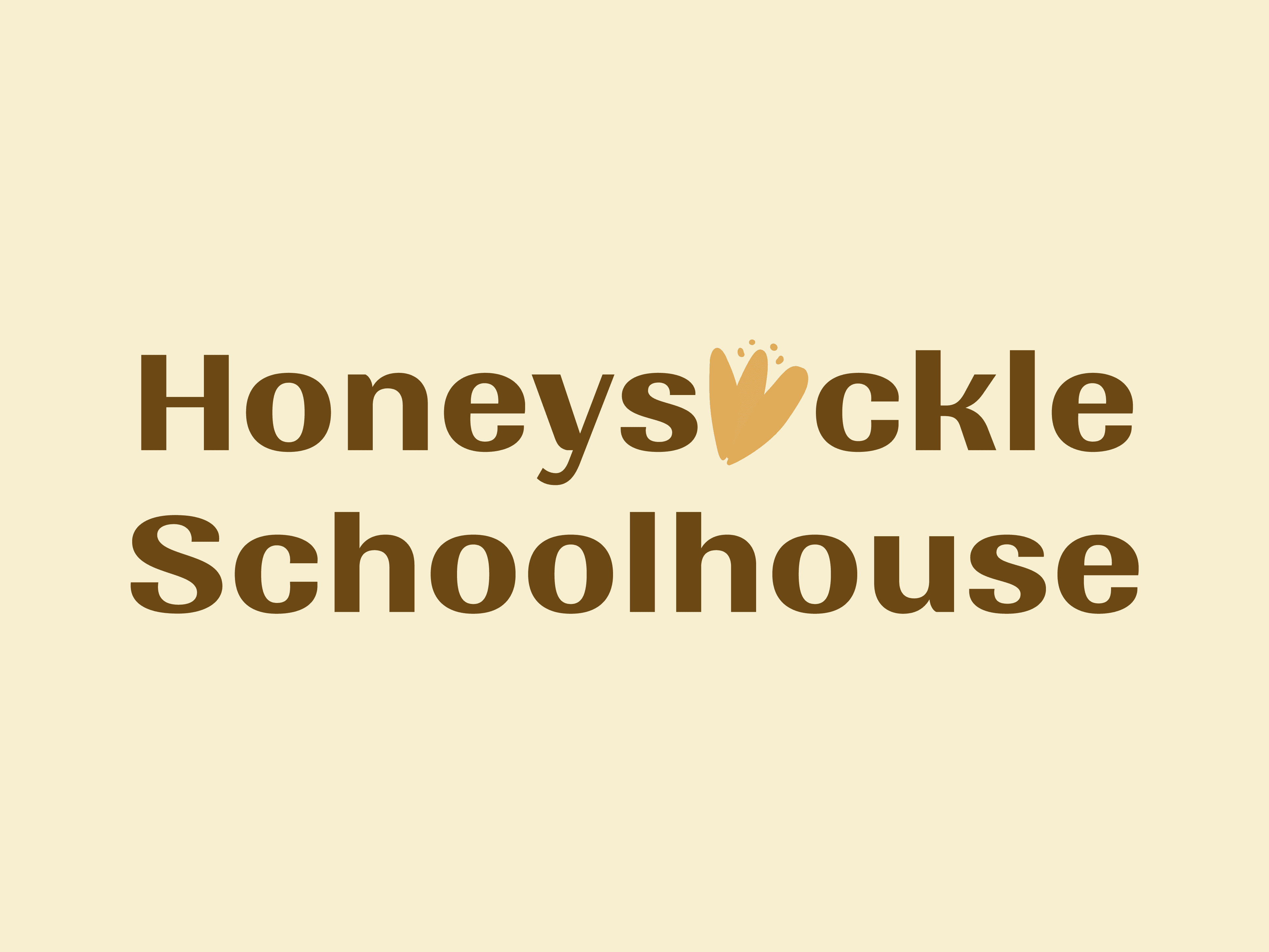
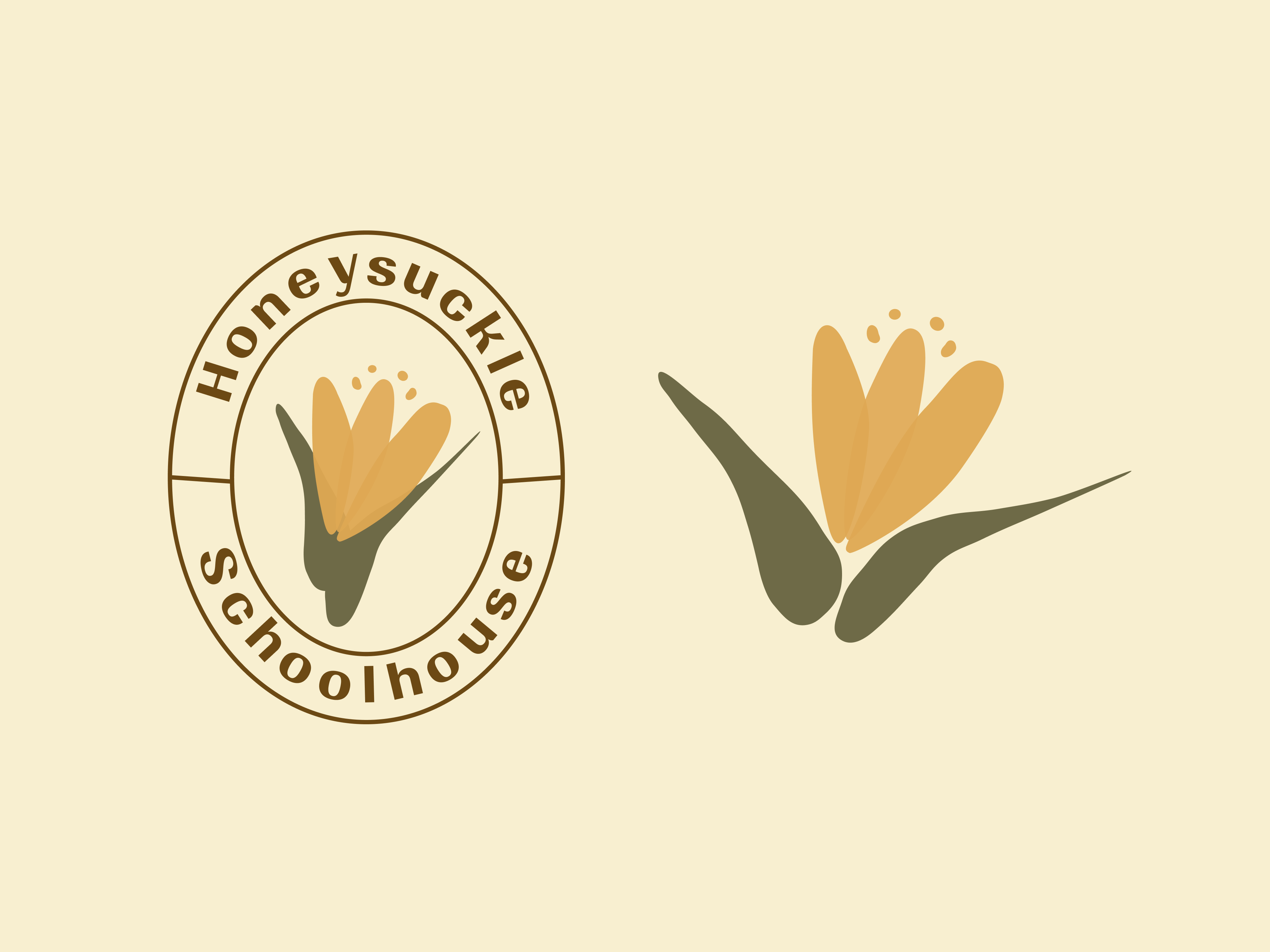
Drawing inspiration from their original logo, I distilled the honeysuckle flower into a simplified, minimalist mark that preserved brand equity while dramatically improving scalability. The refined emblem incorporates a subtle roofline, elegantly merging the flower and schoolhouse concepts into a harmonious symbol. This versatile system includes a primary logo, badge variation, and illustration mark—each designed to function across various applications while maintaining a consistent brand narrative.

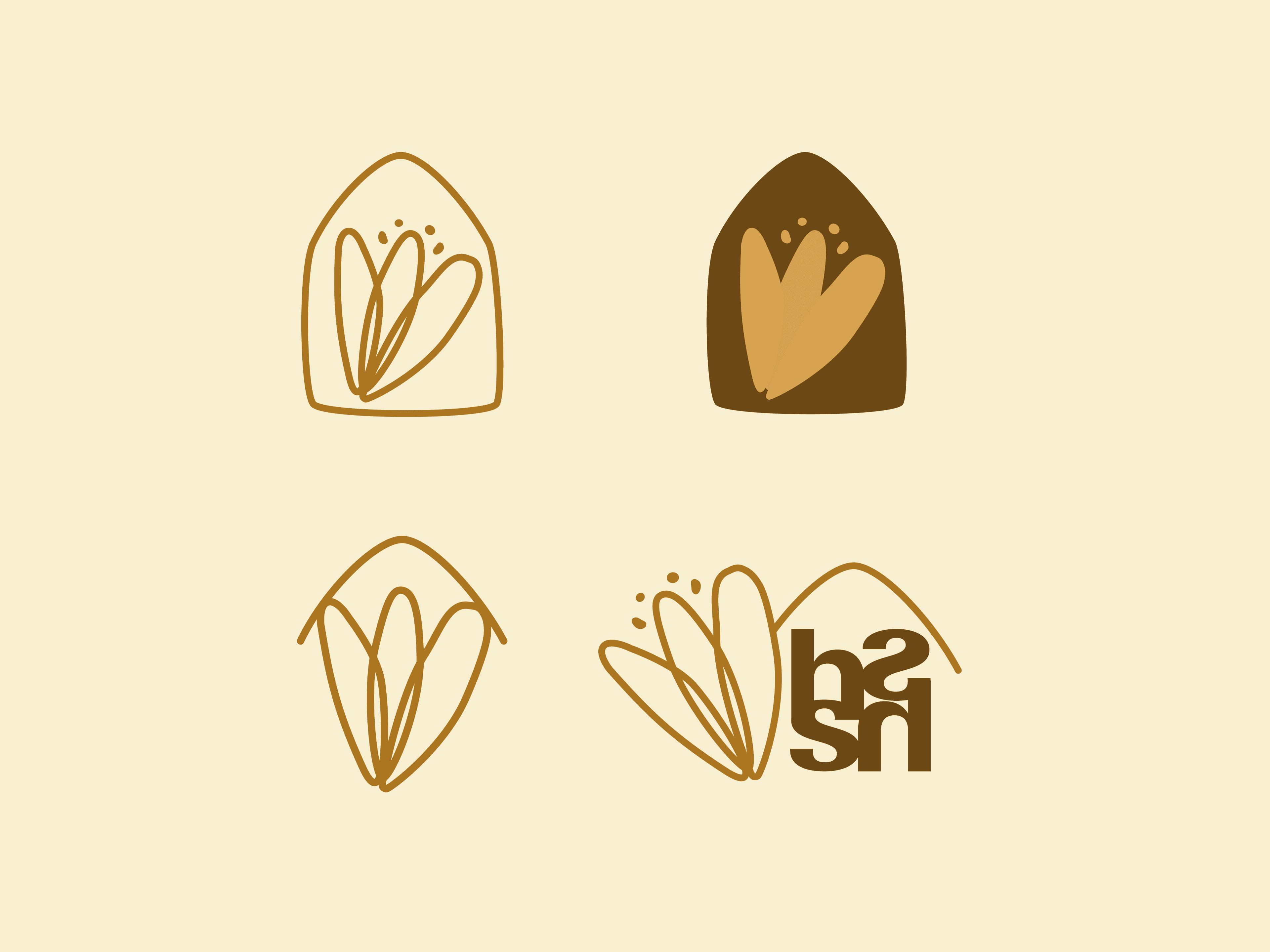

Nature-Inspired Visual Language
The rebrand is anchored by the tagline "Nurtured by nature," which became the conceptual foundation for the entire identity system. This phrase eloquently captures Honeysuckle's teaching philosophy and daily practices. The visual language draws directly from natural elements, with a thoughtfully curated color palette featuring "Ground" (a rich coffee brown) as a warm alternative to traditional black, complemented by hues like Honeysuckle, Pistachio, Moss, and Sea Mist. These colors create a sophisticated yet playful atmosphere that appeals to both children and their parents.

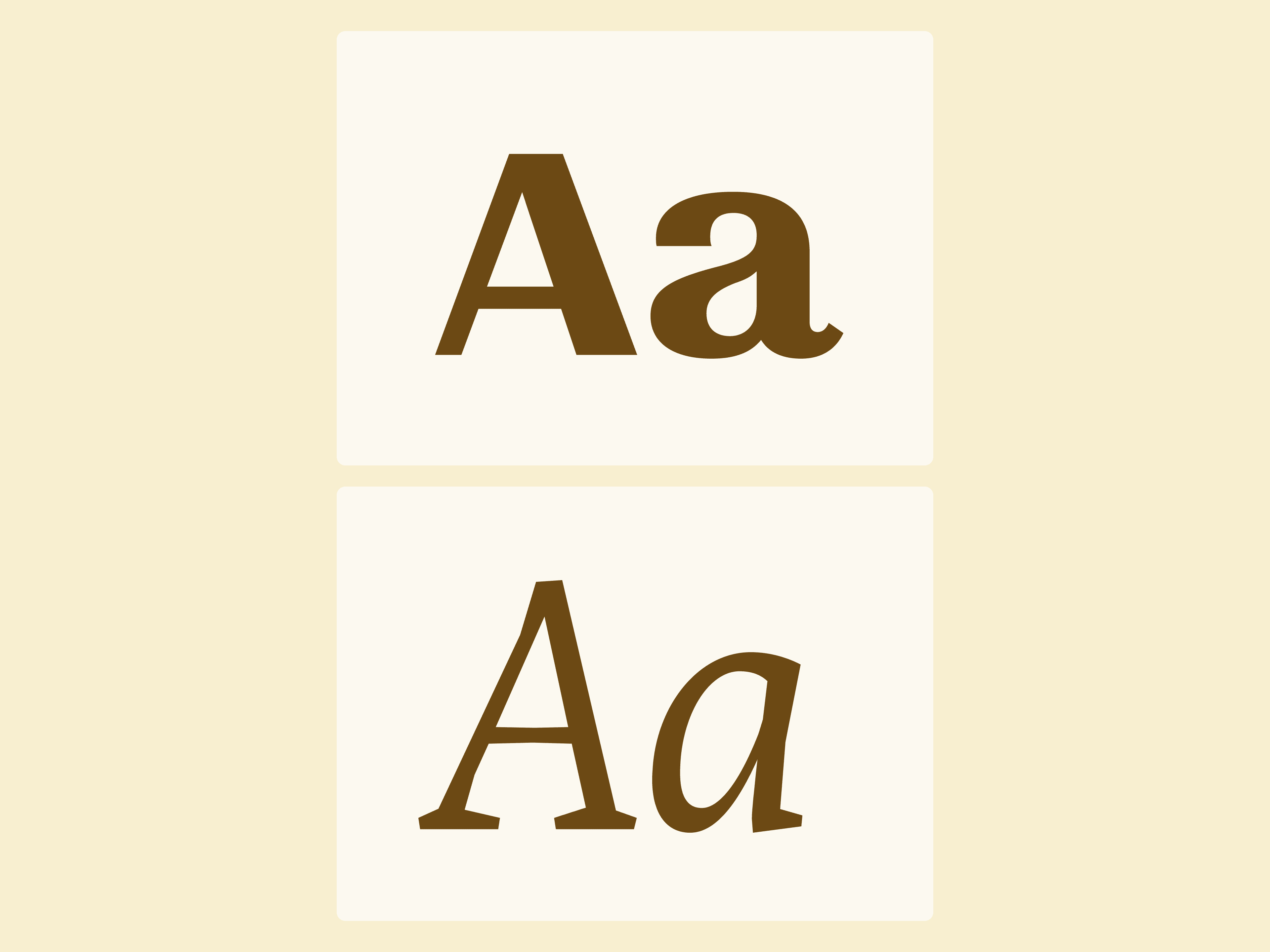
Typography as Character Development
The type system was carefully selected to balance professionalism with childlike wonder. Each typeface contributes to brand perception, fostering trust and recognition among students and families through consistent application. The type hierarchy establishes a clear visual language that communicates Honeysuckle's values of warmth, creativity, and educational excellence—creating comfortable familiarity through thoughtful brand recognition.
Extending the Brand Experience
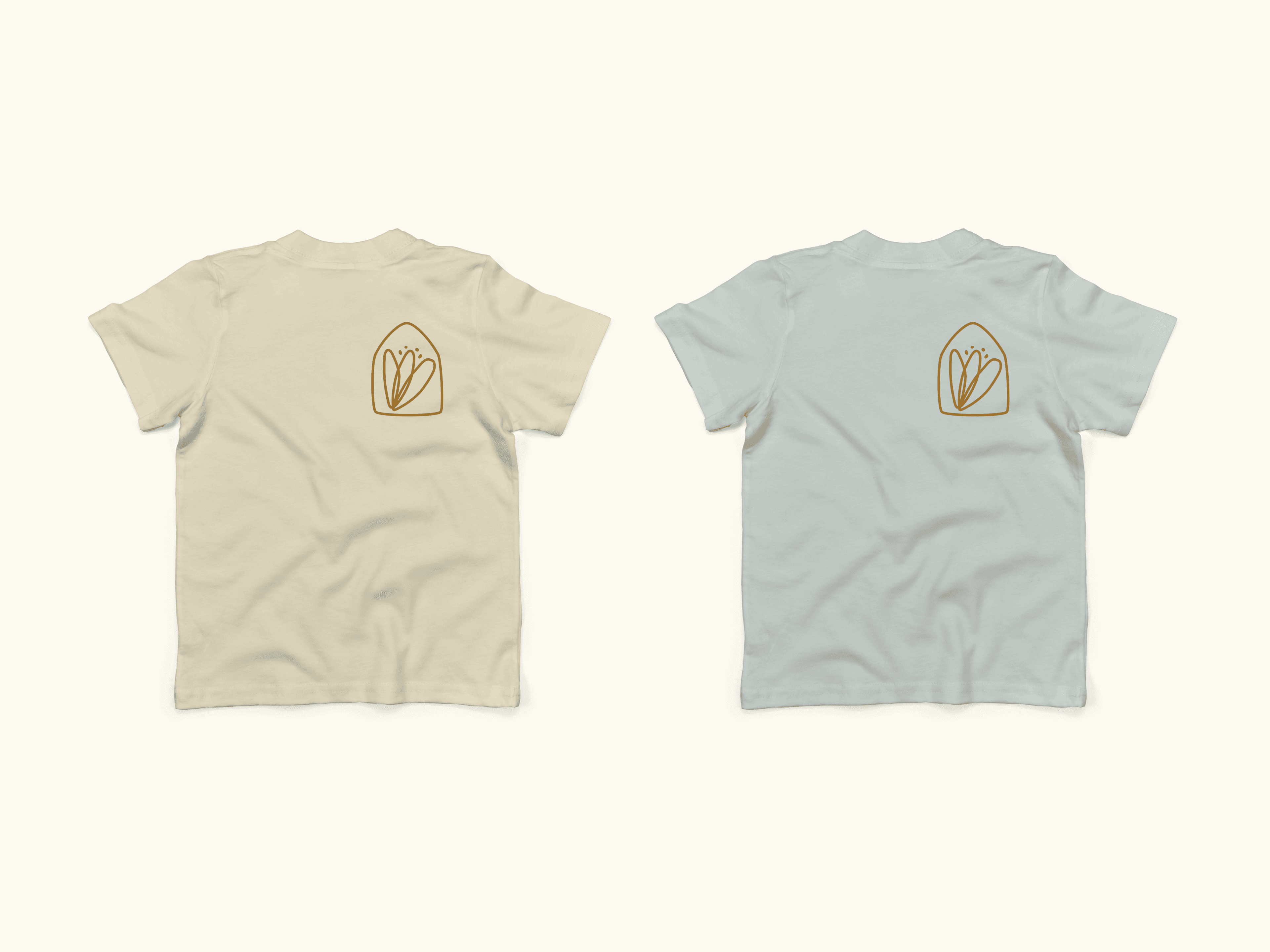
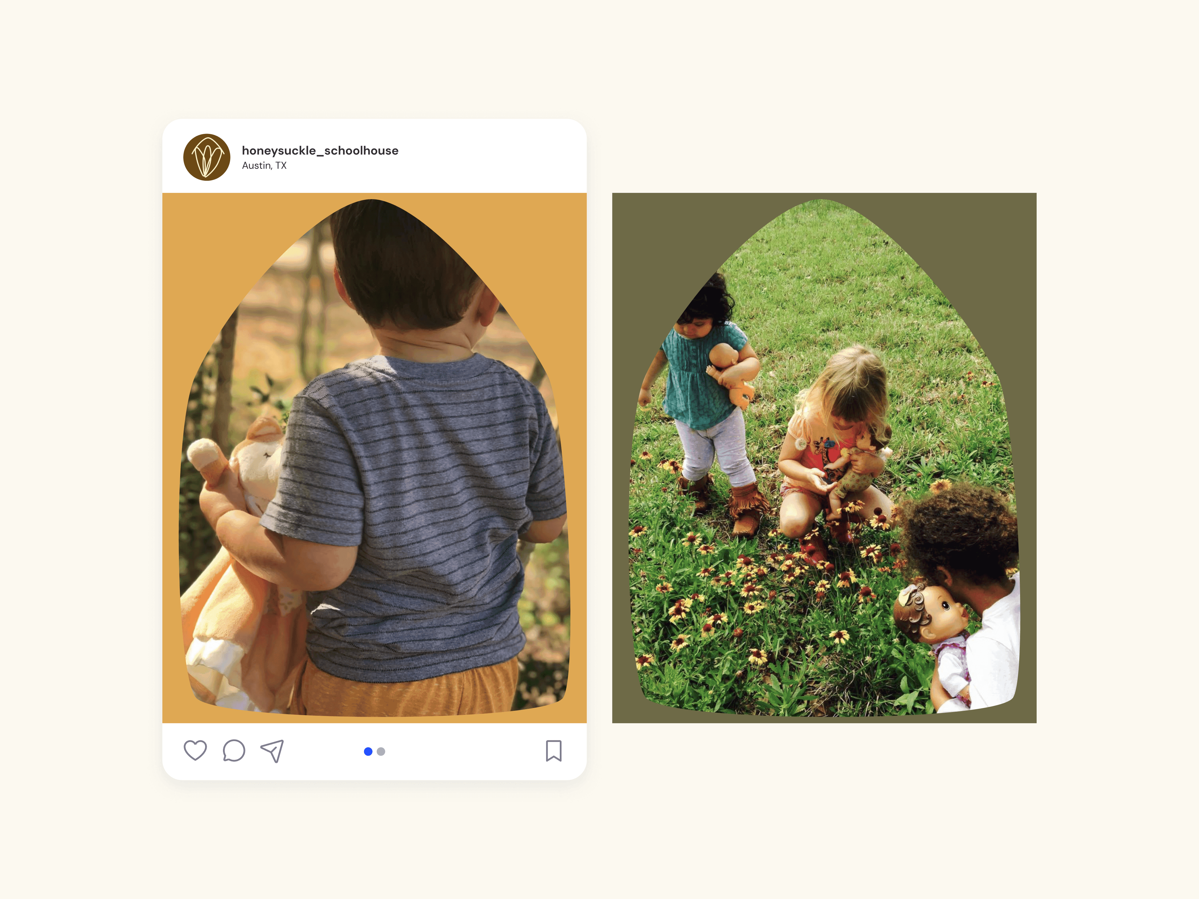
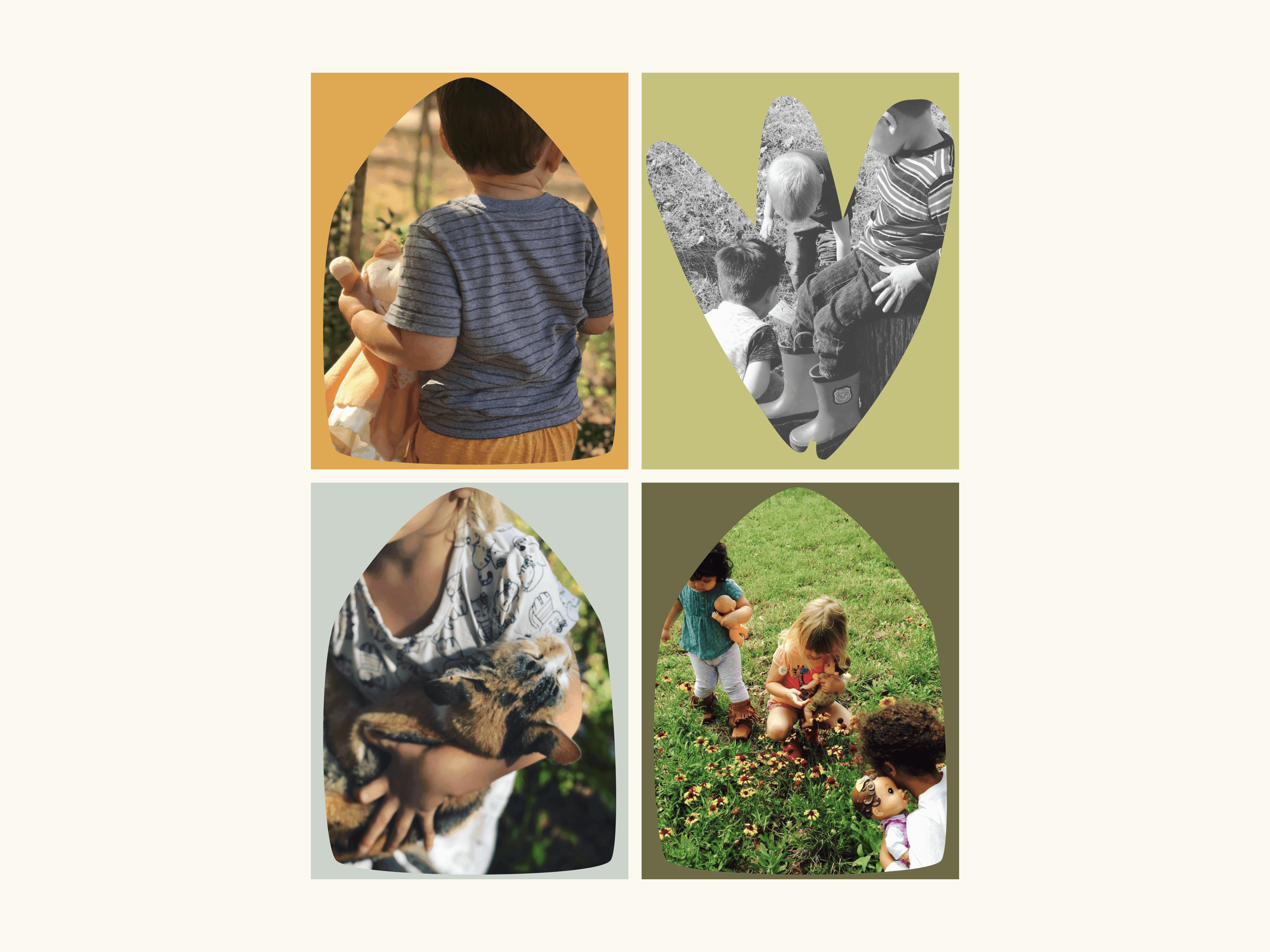
The rebrand extended beyond visual identity to tangible experiences through merchandise designs including toddler t-shirts, adult sweatshirts, tote bags, and baseball caps—all items suited for outdoor exploration and play. These applications reinforce the brand's connection to nature while creating walking ambassadors for the school. Additional touchpoints include Instagram marketing templates featuring the logo as a window to showcase activities and nature experiences, effectively telling the school's story through a consistent visual framework.


Conclusion
The renewed Honeysuckle Schoolhouse identity unites simplicity with purpose, transforming a dated logo into a cohesive brand ecosystem that authentically represents their educational philosophy. The simplified mark ensures recognition across all platforms while the nature-inspired elements create immediate emotional connections with families. This rebrand positions Honeysuckle as a thoughtful, contemporary choice for parents seeking a nature-focused early childhood experience, distinguishing them in Austin's educational landscape while providing practical tools for consistent brand expression.